Researching Film Company Logos
Chene Harris
Researching Film Company Logos
Media Studies
1.

History behind the logo:
There is a legend saying that the very first Paramount logo was drawn on a napkin in 1914. The emblem featured a mountain against a black backdrop, with the company name and stars shining above it.
On the new 1952 logo, the mountain grew higher and moved to the center of the composition. A blue sky with fluffy white clouds lended a fresh, vibrant feel to the design. In 1957, the Paramount branding took a turn towards minimalism. The logo was painted blue, and the landscape lost some of its details.
https://youtu.be/YGl9jv_QKGk
meaning behind the logo:
The 24 stars that form a circle over the mountain stand for 24 actors who signed their contracts with the film studio in 1914. The original plan was to add a new star onto the emblem every time a new actor joined the team. However, the movie industry was developing so fast that Paramount Pictures had to give up on the idea.
the two main symbols depicted on the logo are a mountain and stars above it. There is still debate about the backstory behind the emblem. According to some researchers, it was based off the childhood memories of William Wadsworth Hodkinson – the man who founded Paramount Pictures.
2.


History behind the logo:
The Universal Pictures logo, founded in 1912, has been part a long-lasting part of Hollywood history for many years.
Through the years the company has had various logos:
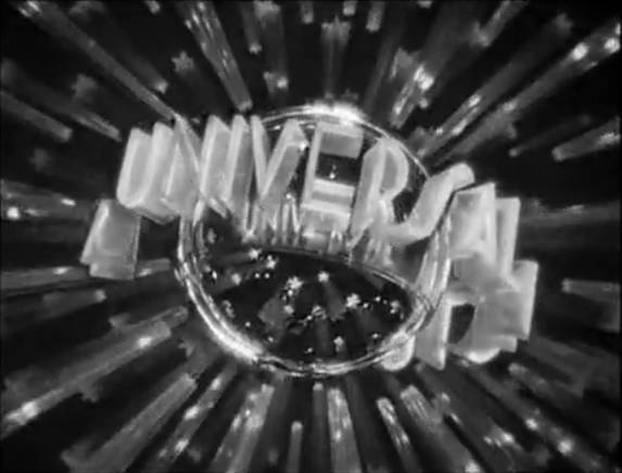
1914-1919
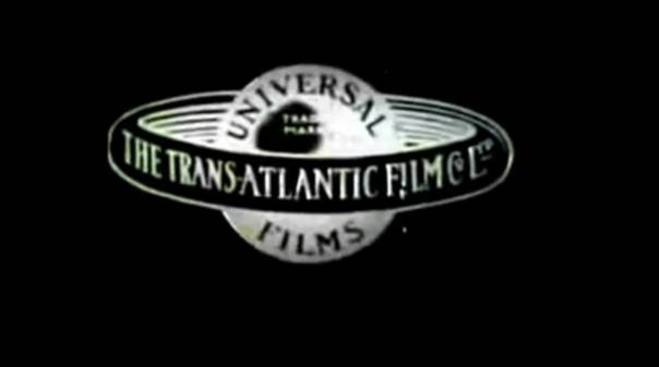
The first logo that was used already showed a globe which has a lot of resemblance to Saturn with its ring.
1920-1922
The ring is now slightly tilted and various fonts are used.
1923-1926
This is the first one where the planet looks like earth. This one shows a plane flying around the world leaving a trail of smoke which slowly turn into the words “Universal Pictures”.
1927-1936
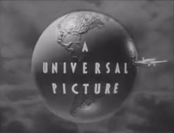
An updated version of the previous logo which also has the plane flying around the globe. The text now reads “A Universal Picture”.
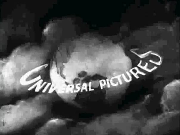
1936-1946
it shows the globe made from Plexiglas with the words A Universal Picture circling around it surrounded by sparkling stars. It was built by Alexander Golitzen and photographed by John Fulton.
1946-1963
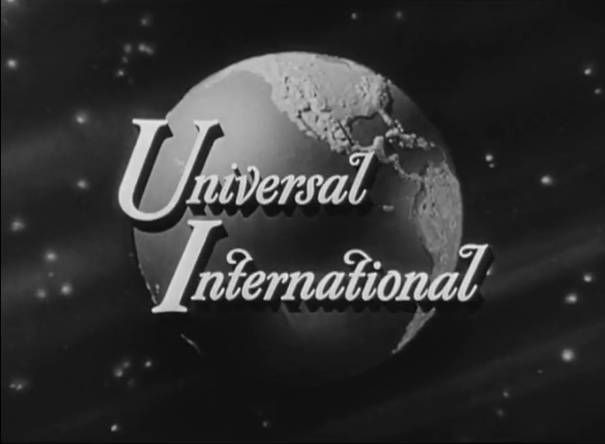
As the company merged with International Pictures Company a new logo was commissioned. This version simply showed a rotating globe with the words “Universal International” shown on top of it.
1963-1990
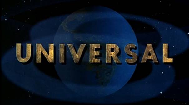
The camera zooms through space towards a rotating earth where the word “Universal” fades in.
1990-1997
This one starts on the side of the earth with a short reflection of the sun on the water after which the Universal letters come around as the camera slowly zooms out to show the earth and the stars behind it. It’s interesting to note that this wasn’t done with CGI, but was all model work.
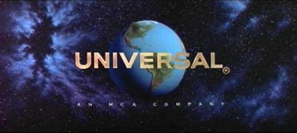
1997-2012
The brand new logo to celebrate the 100th Anniversary. It will be shown first with the animated movie The Lorax
https://youtu.be/KpNkgRv_8XE
The first CGI version of the logo where light emerges from the globe, slowly revealing the continents. The name Universal appears in gold and white lettering.

History behind the logo:
In 1994 the DreamWorks studio logo represents a boy fishing on a crescent moon.
The story of this logo dates back to 1994 when Steven Spielberg (Director), Jeffery Katzenberg (Disney Studio Chairman), and David Geffen (Record Producer) came in close collaboration to develop a new studio called ‘DreamWorks’.
Spielberg wanted the logo for DreamWorks to be reminiscent of Hollywood's golden age. The logo was to be a computer generated image of a man on the moon, fishing, but Visual Effects Supervisor Dennis Muren of Industrial Light and Magic, who has worked on many of Spielberg's films, suggested that a hand-painted logo might look better.

History behind the logo:
1985 logo

On a dark purple/blue gradient backdrop, a shower of light descends from the top of the screen, forming a stylized, segmented castle which is a white/purple gradient with only 6 flags. The segments seem to be spaced farther apart by the time the light reaches the bottom. Through the main gate of the castle, a white ball of light forms then extends out to form the words "Walt Disney" in the familiar corporate "Disney" logo font. The word "PICTURES" fades in underneath, and a white semi-circular line is drawn over the castle to the bottom left. This version was used until 1989.
1990 logo

From 1990 until 2006, the background is a light blue, and the castle is a lighter blue. The line now stops when it hits the tip of the "W" in "Walt Disney".Beginning in 2002 the logo was altered slightly having a brighter blue tint and added the missing 7th flag.Later reissues of classic Disney movies including those released during the mid-to-late 1980s began using this.
1995 logo

In 1995, a CGI-customized version of the 1990 Walt Disney Pictures logo was introduced for Pixar movies.This logo appeared in every Pixar animated film from Toy Story until Ratatouille in 2007, with the exception of Buzz Lightyear of Star Command: The Adventure Begins, which uses the 1990 logo instead.In 2008 this CGI logo was retired in favor of the 2006 Walt Disney Pictures logo, beginning with WALL-E
2000 logo

In 2000, Disney introduced a different logo, in which the screen was black and a glowing orange beam appeared on the screen and shone light on the words Walt Disney Pictures. The light then shines the glowing arch, revealing the castle and fades out in the
Though unlike the blue logo, where the castle stays as the screen fade outs, the orange logo wipes away as the screen fades.
2006 logo
This logo begins with a glowing star shining in the night sky, like in the movie Pinocchio. The view then heads down to what appears to be the Magic Kingdom, complete with a sailboat on a river and a train going down a railroad track. Then, it heads high over Cinderella's castle, with fireworks going off. Eventually, it settles in front of the castle, in which the glowing arch flies over it, and the title appears at the bottom.Later reissues of classic Disney movies released on DVD and Blu-ray began using this.
2011 logo
n 2011, the Walt Disney Pictures branding was shortened simply to "Disney", starting with The Muppet's This logo was rendered by Cameron Smith and Cyrese Parrish. A version without lettering is seen as a screensaver on Disney Blu-Rays released since 2012.

Originally in 1924, Columbia Pictures used a logo featuring a female Roman soldier holding a shield in her left hand and a stick of wheat in her right hand. The logo changed in 1928 with a new woman (Columbia, the female representative of America) wearing a draped flag and torch.
Columbia Pictures: Their name and torch-bearing female logo refer to Lady Columbia, which is the mostly forgotten female symbol of the United States. Before there was Uncle Sam, there was Lady Columbia in her patriotic robes and armor, leading the way for America


Hi Chene
ReplyDeleteOverall Score 14/20
Well done in researching all the logos above. However, please make sure you do NOT cut and paste any information. All research needs to be rewritten in your own words or included in quotation marks with the source cited.
Please also preview your blog after publishing to make sure pictures have been embedded correctly.